Brief
I was briefed to redesign the identity to Creavens; an architecture/construction services company. I was to give the current look a clean, mature and approachable look.
Design Approach
I treated this aspect with a lot of detail ensuring that the keywords intended for the design to connote were not lost. Below is what the previous identity looked like.

Former logo
There wasn’t so much to take from it to be reused in the new identity, so I payed more attention to “Architecture& construction”
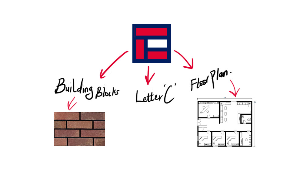
I decided to use the letter ‘C’ to create a bold logo mark identity explore the basic construction shape (rectangle) we have in creating the identity also because of its resonance to their importance in actual construction.
After doing some sketches….
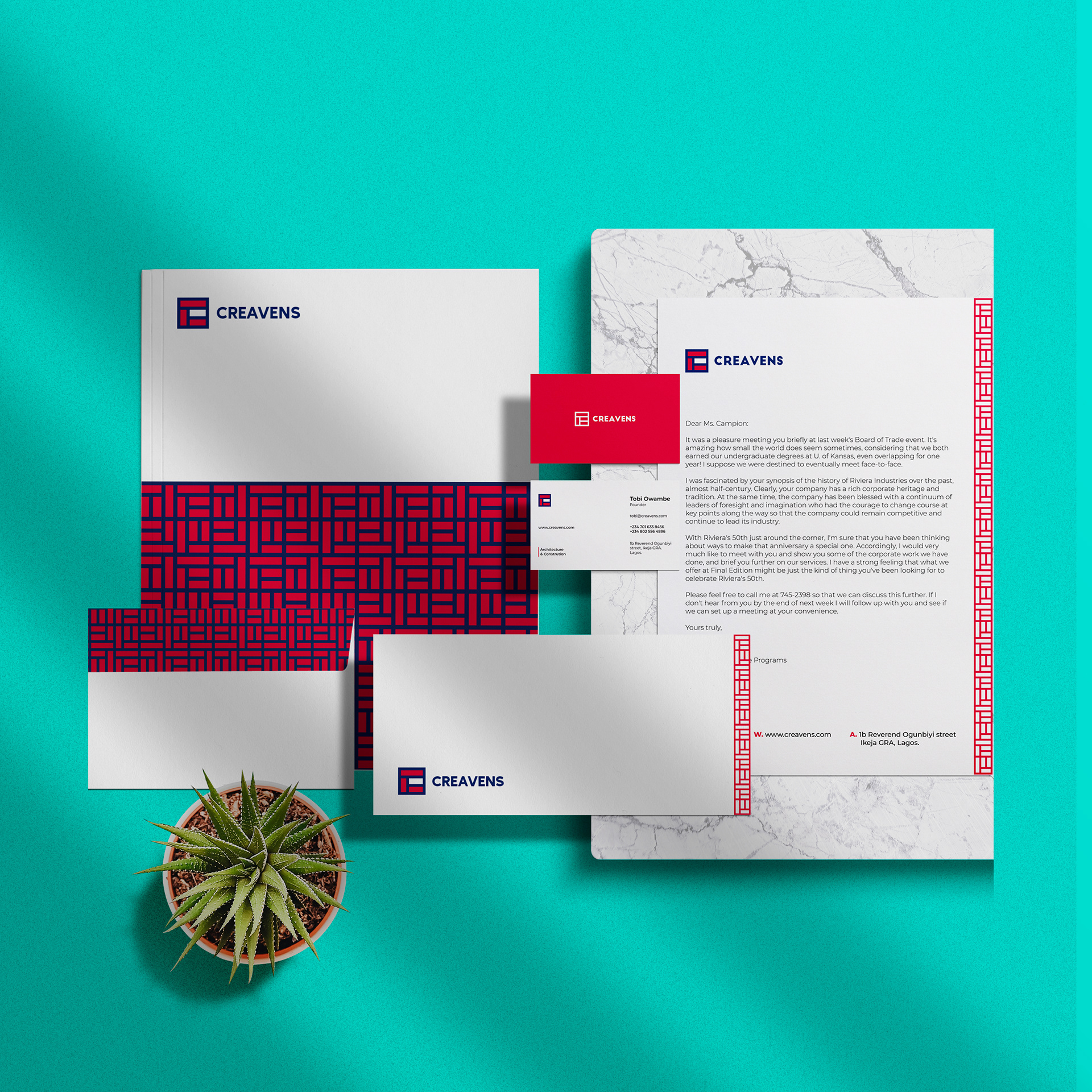
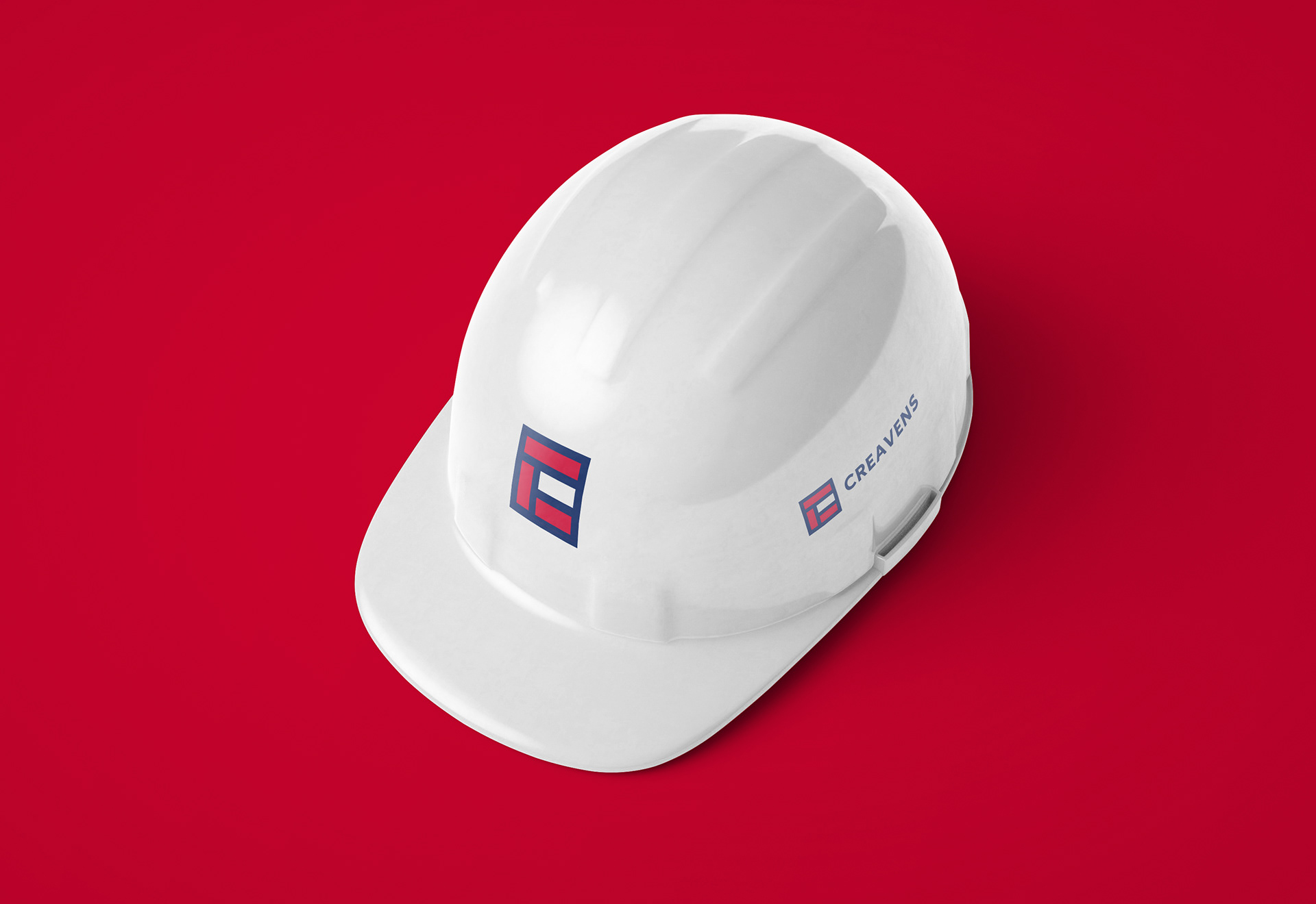
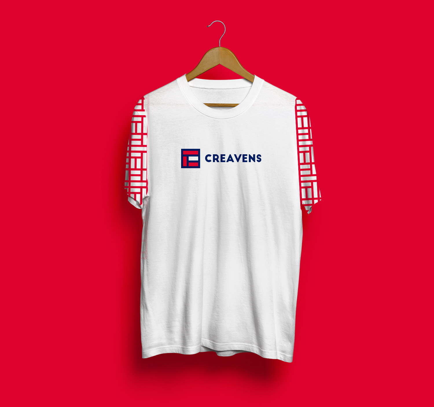
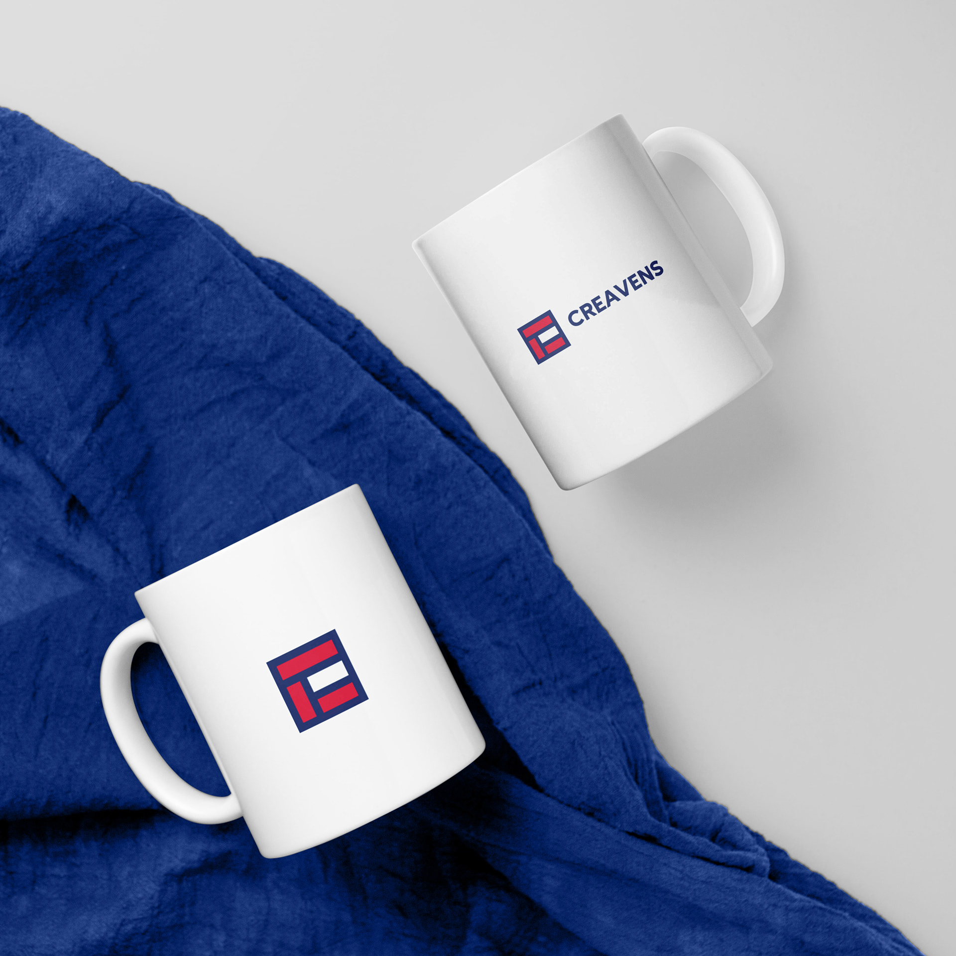
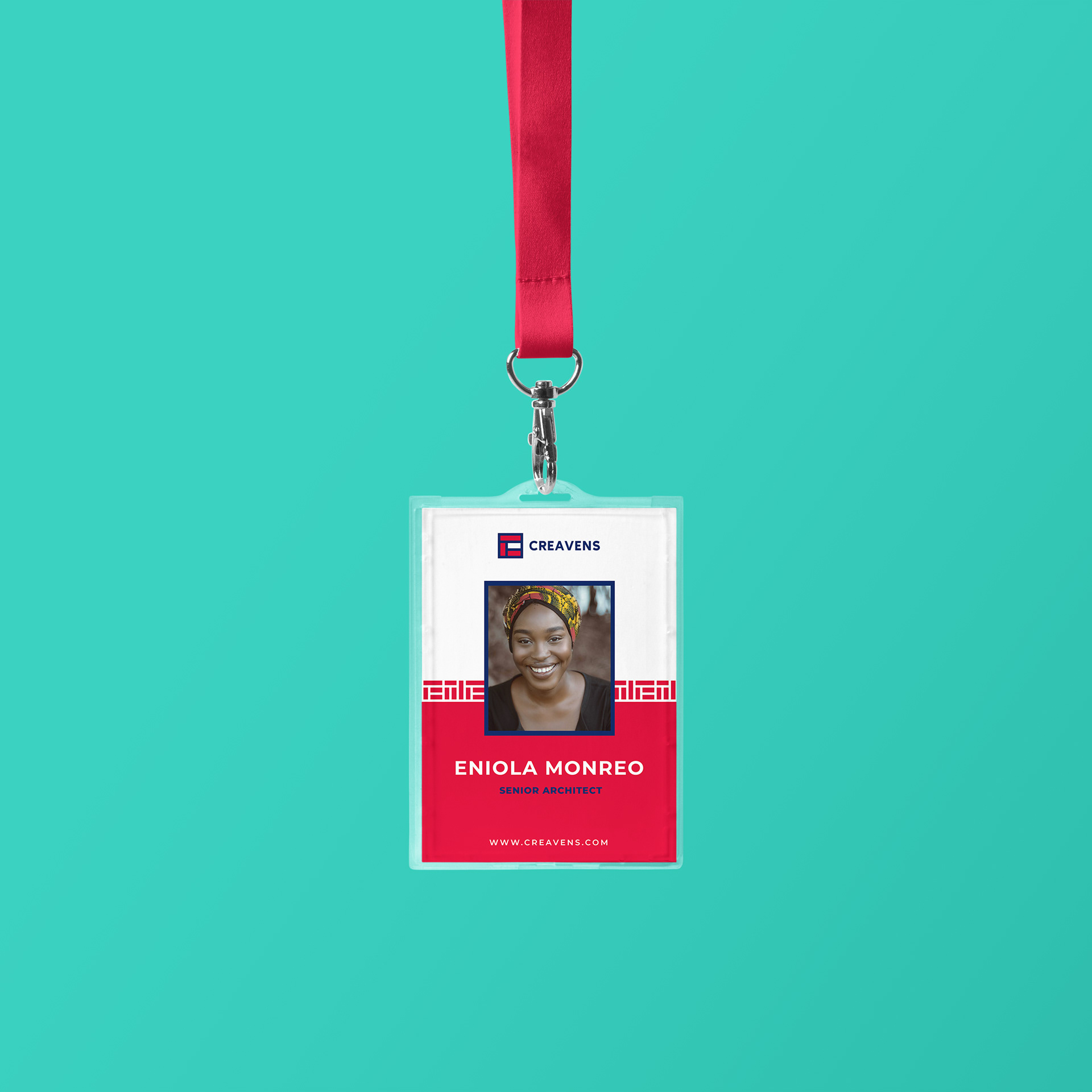
The Logo
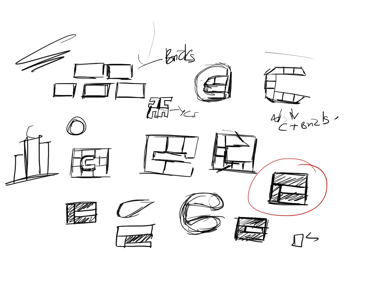
I came up with a bold logo mark, which is a combination of a building block, a floor plan and the letter ‘C’